- Oct 9, 2025
Critique of the Week: T-Shirt Shop
- Sherice Jacob
- Critique of the Week

Welcome to the first critique of the week. Our first volunteer is a t-shirt shop in Los Angeles, who asked me to critique their product page. The brand has been anonymized on request.
Overall First Impressions
The Good:
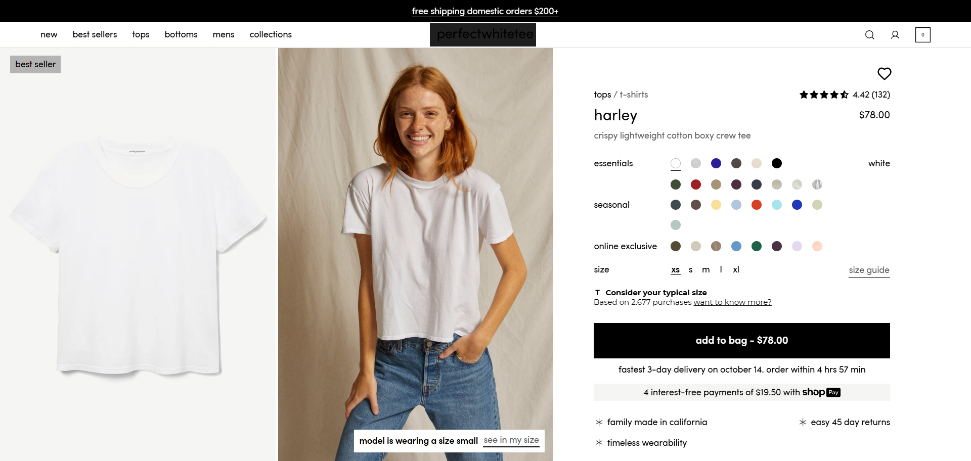
You can tell there's a real aesthetic. The brand knows who it is: clean, minimal and intentional. Nothing on the page feels noisy or accidental. The copy trusts the product to carry weight -- "you come for the white tee, you stay for everything else" is confident without being smug. It's calm and creates the sense that it has earned its authority.
-
You've got embedded brand values through the language you use, like "garment-dyed", "Made in California", and "wardrobe builders". The best DTC brands do this too; they find their 3-5 core concepts and say them so consistently that the customer starts to associate them with the brand itself. That's happening here too, even if it's subtle.
This brand isn't pushing a hard sell on the basics. It's not dipping into "must have closet staple" language. It's worded for people that already get it, and when customers are treated like they're already in-the-know creates greater loyalty with the brand.
What Needs Work
There's no hook to be found. There's nothing on the page to pull the user in, no story or bid idea. No "here's why this exists" or "why choose this tee over another one." If you're attracting cold visitors, you're giving sizzle with no steak. This could be fixed with a positioning line, something like "This Will Be Your Favorite Tee Before You Even Put It On" Give the visitor something to believe in and hang onto before you ask them to buy.
-
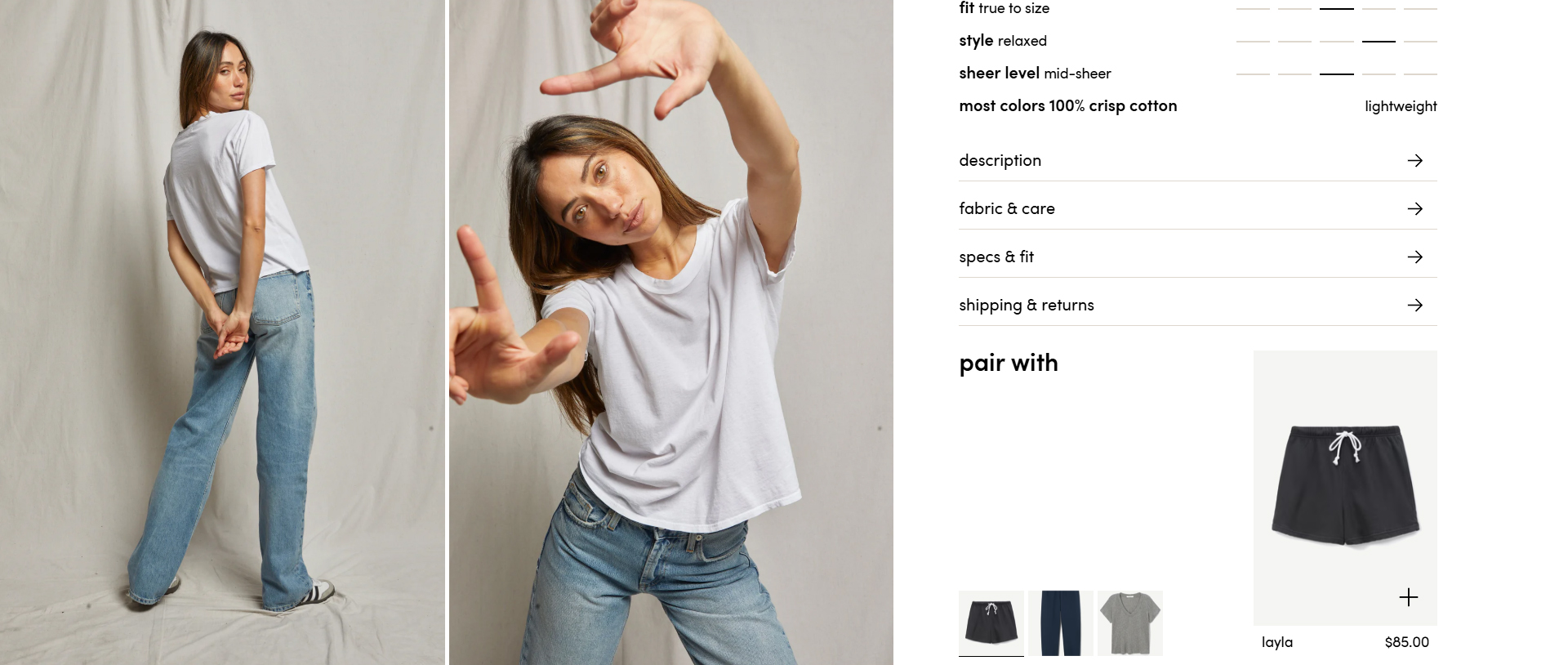
The product descriptions feel like inventory metadata. "Crispy lightweight cotton boxy crew tee." Crispy? Is it stiff and crackly? How does this tee make you feel? How does it fit into your life? You can fix this with a single-line setup, something like "Relaxed, refined, and ready-to-wear on repeat." Show don't tell: Washes well. Layers even better.
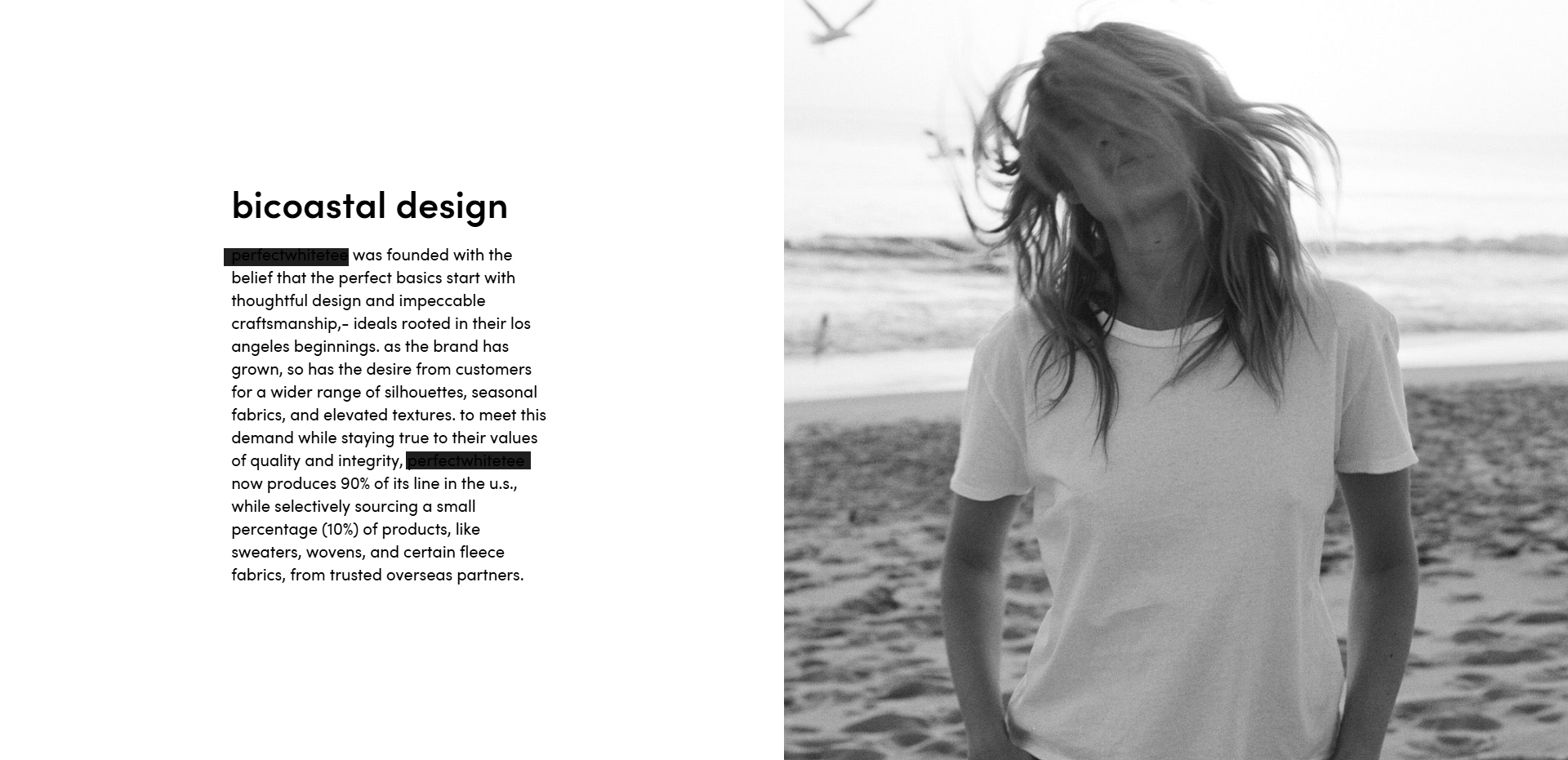
No story behind the brand. We get a little story of how the brand started, but we never get the why. Why did that specific tee matter? What was missing in the market? What made the founder go "Screw it, I'll do it myself." This is called an "emotional anchor". I can buy a t-shirt anywhere, the story is going to be what sets yours apart.
Conversion Micro-Moment: The FAQ
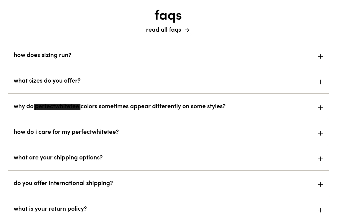
Most online stores don't realize that the FAQ is a conversion micro-moment. FAQs are terribly under-leveraged as a source of conversions. For example, for "How does sizing run?" the answer is: "most of our pieces are true to size. we have style descriptions under each piece for a better understanding of the fit of each individual style."
Don't make your users scroll around to find the answer. Every apparel brand tells me their pieces are "true to size". How does that tell me about your fit philosophy or how confident I should be when ordering? An easy fix would be: "Our pieces are designed to fit with a naturally-relaxed silhouette, built for ease, not tightness. Each style includes a short fit note right on the product page (just under size options), so you'll know exactly what to expect when you order. Still not sure? If you're between sizes, we suggest sizing up for a looser drape."
Right now, this brand has all the raw materials: a clean aesthetic, a strong product, and a confident tone. But the words on the page aren't pulling their weight. They're quiet in places where they should be persuasive. The best t-shirt brands know that great copy can still be minimalist but it needs to move the user. Tell me what I'm buying beyond cotton and color, because yes, the tee might be perfect, but the copy should be too.